
020-85201717 / 13725302004
方法一(毛玻璃效果):背景圖 + 偽類 + flite:blur(3px)
方法二(半透明效果):背景圖 + 定位 + background:rgba(255,255,255,0.3)
CSS實(shí)現(xiàn)背景圖片透明,文字不透明效果的兩種方法
項(xiàng)目中經(jīng)常會(huì)用到背景圖上放一些文字介紹,這里介紹兩種技術(shù)來實(shí)現(xiàn)背景圖片透明,文字不透明效果,記錄一下,方便日后學(xué)習(xí)。
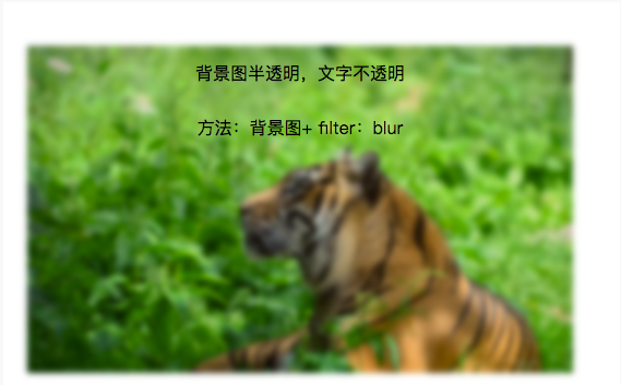
1.毛玻璃效果:
背景圖 + 偽類 + flite:blur(3px)
.demo1{
width: 500px;
height: 300px;
line-height: 50px;
text-align: center;
}
.demo1:before{
background: url(http://csssecrets.io/images/tiger.jpg) no-repeat;
background-size: cover;
width: 500px;
height: 300px;
content: "";
position: absolute;
top: 0;
left: 0;
z-index: -1;/*-1 可以當(dāng)背景*/
-webkit-filter: blur(3px);
filter: blur(3px);
}
1
<div class="demo1">背景圖半透明,文字不透明<br />方法:背景圖+ filter:blur</div>
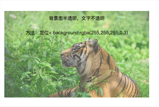
2.半透明效果:
背景圖 + 定位 + background:rgba(255,255,255,0.3)
.demo2-bg{
background: url(http://csssecrets.io/images/tiger.jpg) no-repeat;
background-size: cover;
width: 500px;
height: 300px;
position: relative;
}
.demo2{
position: absolute;
left: 0;
right: 0;
top: 0;
bottom: 0;
width: 500px;
height: 300px;
line-height: 50px;
text-align: center;
background:rgba(255,255,255,0.3);
}
<div class="demo2-bg">
<div class="demo2">背景圖半透明,文字不透明<br />方法:定位+ background:rgba(255,255,255,0.3)</div>
</div>
以上所述是小編給大家介紹的CSS實(shí)現(xiàn)背景圖片透明而文字不透明效果的兩種方法,希望對(duì)大家有所幫助。
版權(quán)所有:廣州騰虎網(wǎng)絡(luò)科技有限公司
粵ICP備13073147號(hào) 

開發(fā)")


